(Image Credit: iStockPhoto/Ursula Alter)
How long it takes a user to load a website has increased over the years due to complex design choices, according to a new report from Dynatrace. The digital performance company observed this global phenomenon and notes websites are seven percent slower than last year.
Dynatrace tracked the homepage response times of 300 leading retail sites in the UK, US, France, Germany, China, Australia, Spain and the Nordics, testing every 10 minutes for the last 12 months. Over this period, the company found new design trends and functionality expectations has slowed response times.
Separate research indicates that consumers expect a website to load within three seconds or less and over that results in 46 percent of consumers abandoning the page. This damages relationships with users and can have a detrimental impact on revenues.
Dave Anderson, VP Marketing EMEA and Asia Pacific for Dynatrace, explains: “While lags in performance are concerning, they also present a big opportunity to measure response times more closely and link it back to revenue. Take a leaf out of Nordstrom’s book – it has measured that a mere 0.5 second slow-down in site load time equates to an 11% reduction in site conversion. This is precisely where retailers need to focus internal conversations: looking at site performance and how it impacts revenue.”
China and the Nordics made notable improvements over the past year, but they are still playing catch up against other countries. France was the stand-out performer, with a 20 percent speed increase moving the country from position five in 2015 to number two in 2016. The UK, on the other hand, enjoyed pole position in 2015 but slid into third place in 2016. The US was bumped out the leading three, whilst Australia dropped below China into the bottom spot with response times increasing from 5.4 seconds in 2015 to 8.2 seconds in 2016.
|
Country |
2015 response times |
2016 response times |
% change in homepage response times (2015 – 2016) |
% change in average no. of third party hosts (2015 – 2016) |
% change in average no. objects (2015 – 2016) |
% change in average page size (2015 – 2016) |
|
Global |
4.2 secs |
4.5 secs |
+7.14% |
+18% |
+7% |
+8% |
|
Spain |
3.1secs |
3.3 secs |
+6.45% |
-5% |
+5% |
-13% |
|
France |
4.4 secs |
3.5 secs |
-20.45% |
+20% |
+15% |
+25% |
|
United Kingdom |
2.9 secs |
3.7 secs |
+27.59% |
+22% |
+15% |
+18% |
|
United States |
3.4 secs |
3.9 secs |
+14.70% |
+12% |
+7% |
+5% |
|
Germany |
3.7 secs |
4.3 secs |
+16.21% |
+5% |
+8% |
+18% |
|
Norden |
5.2 secs |
4.4 secs |
-15.38% |
+16% |
-17% |
+5% |
|
China |
5.8 secs |
4.9 secs |
-15.52% |
+15% |
+7% |
+18% |
|
Australia |
5.4 secs |
8.2 secs |
+51.85% |
+27% |
+13% |
+6% |
When designing a website, trends lead towards big images and several interactive objects such as social widgets. Across our publications we've been guilty of this ourselves, with a redesign we put in place a couple of years back offering a much improved visual experience but slowing load speeds down. Over the past couple of days we've made several changes which has greatly increased the speed, but admittedly there is still work to do.
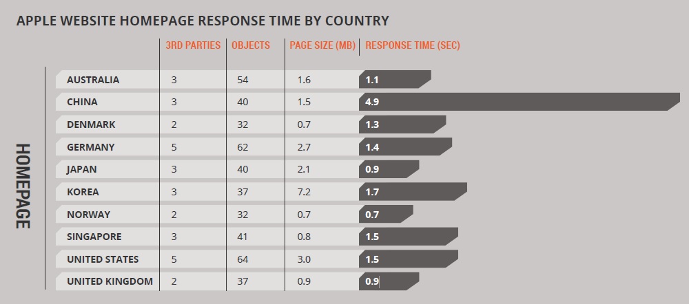
Apple's website is used by Dynatrace as the best-practice example – with the international retailer nailing its performance in every country it operates through building websites with little hosts and yet delivering a simple but visually-engaging user experience.
 (Image: Apple Website Response Time)
Dynatrace's research has indicated that – when it comes to websites – less is more and bigger isn't better. The best performers had small page sizes, smaller object counts, and fewer third party hosts.
What are your thoughts on increasing website response times? Let us know in the comments.


